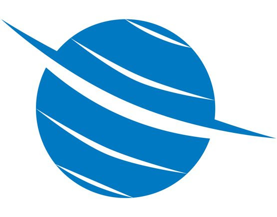
Avtex
Leaders of audio-visual electronics for the caravan and mobile home market. The logotype reflects the fluidity of this ever-changing industry and emphasises the audio-visual nature of Avtex products.
The simplicity of the design is crucial as it has to be rendered onto a variety of manufactured products.

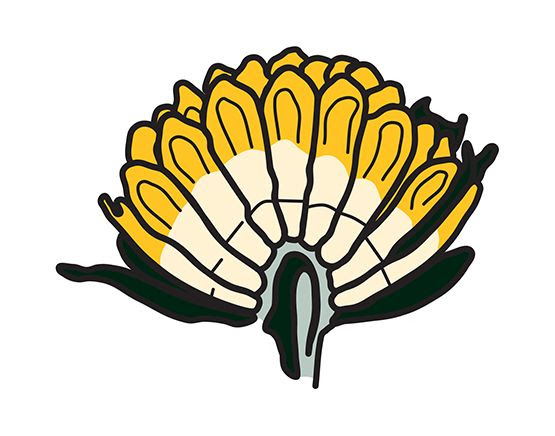
Llwynywermod
Llwynywermod (grove of the wormwood) is the Welsh home of TRH Prince of Wales and the Duchess of Cornwall.
We were asked to design an identity for the house in its use as a discussion location for matters close to those of the Prince. The identity is a cross-section of the wormwood plant (a visual metaphor for Welsh life). The cross-section the plant also takes the form of a coronet.
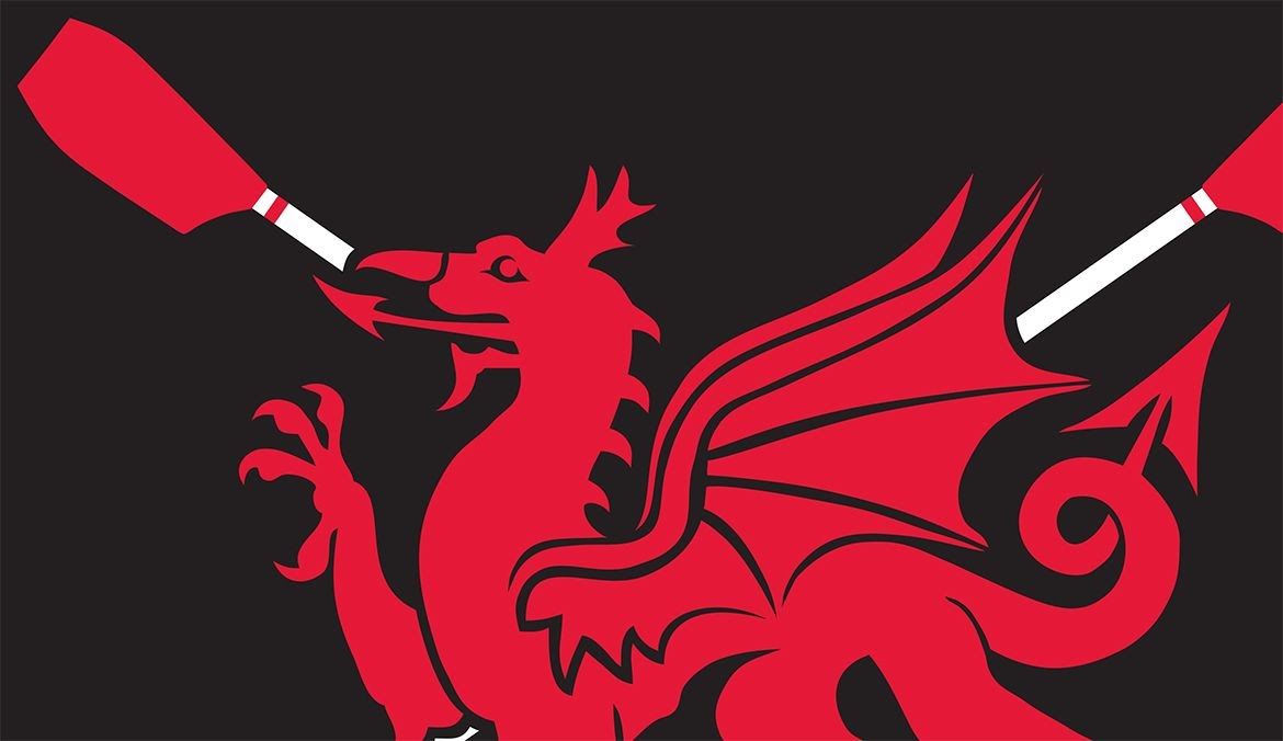
Welsh Rowing
The national sporting body for rowing on land, river and sea in Wales required a cohesive, flexible identity to work across its interests and alongside the identities of the four other home nations.
Summertime in Carmarthenshire
A masthead identity for a tabloid magazine for Carmarthenshire County Council promoting the seasonal leisure and tourism activities across the county.
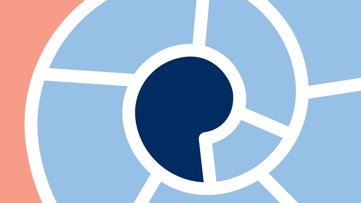
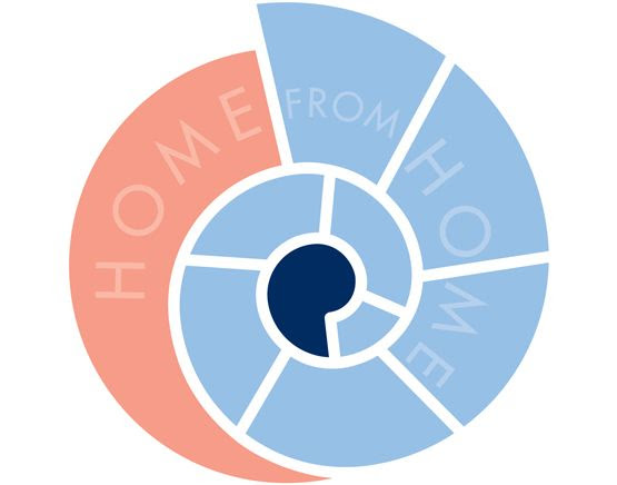
Heather Thomas Homes
An identity design using the symbolism of the golden spiral within a Nautilus shell as a visual metaphor for this developer of homes for students.
A clean, fashionable, professional and secure identity was developed to communicate the attributes of the properties to both student and parent alike.

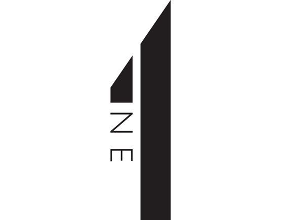
One Consulting
One Consulting connects career-driven business professionals and qualified engineers with leading corporations.
A typographic identity evolved to reflect the competancies of the candidates put forward by this specialist recruitment company.
The identity is clear, focussed, sharp and upright – a visual metaphor for professional people.
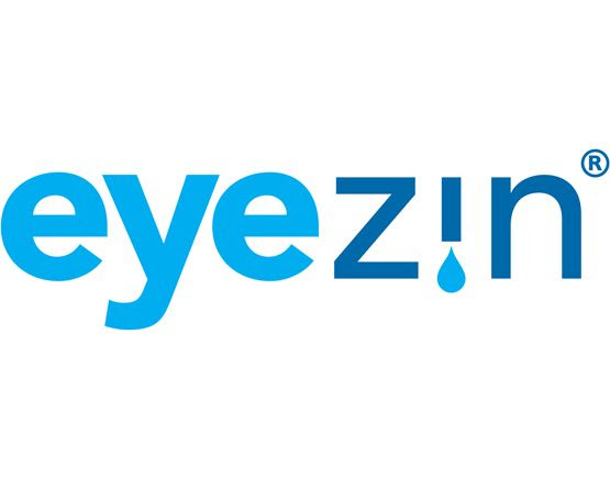
Eyezin
Eyezin is a unique, patented, state-of-the-art zinc-hyaluronate eye drop solution for the relief of mild to severe dry eye symptoms. A typographic identity was developed which also pictographically represents the solutions application through an eye droplet.

EWS
EWS is the UK’s market leader in the manufacture and supply of cold rolled products. Equator Wheel Sections (EWS) started manufacturing in Wolverhampton over 100 years ago.
The identity developed into a roundel which encapsulates the multitude of identities used over the years whilst also embracing the original name of the business. The identity had to work down to 6mm in width to be embossed onto their product.
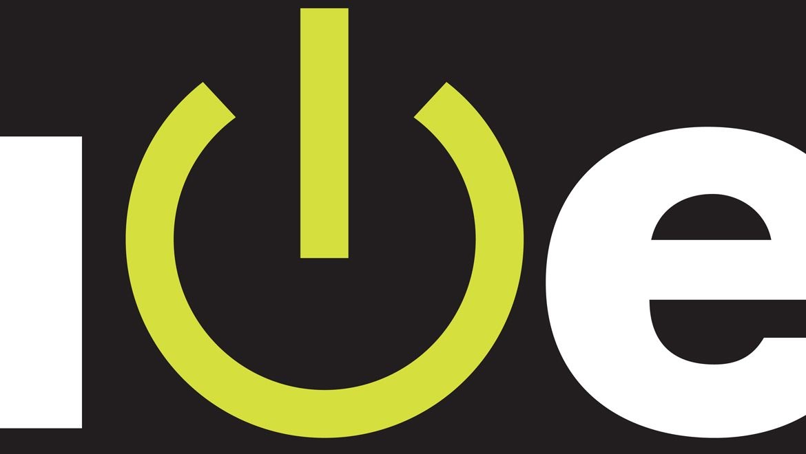
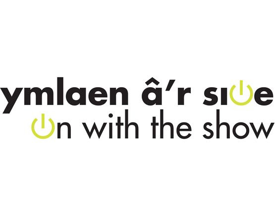
S4C
‘On with the show’ campaign identity for digital switch-over. A bi-lingual logotype was developed using the typeface Futura. The ‘o’s in each language were replaced with fluorescent green ‘on’ buttons which are animated for TV and on-line usage. The campaign was voted ‘Winner’ at the 2010 CIPR Excellence Awards (integrated Campaigns) and ‘Silver’ at Promax UK 2009 Awards (Best Press / Public Relations Campaign).